


HPE Intern Project
System to notify users of design system guidance updates.
My Role
UI/UX Designer
Duration
June - September 2023 (10 weeks)
Tools
Figma
Github
Team
1 Designer (myself)
1 Developer
Context
Summer 2023...
This past summer I had the privilege of interning on the Design System team at Hewlett Packard Enterprise (HPE) as an UI/UX Designer. For 10 weeks, I worked with a development intern on this project to build a system that notifies users of guidance updates to the design system component guidance. Throughout the process, I also collaborated with the rest of the Design System Team and other teammates within the larger Experience Studio to receive feedback and conduct user testing.
Problem
HPE's product teams heavily consume the design system guidance and relies on the design systems website for information. Other teammates repeatedly brought up the issue of not being able to keep up with design system guidance updates. There currently exists a What's New page on the design systems website. However, based on user feedback and site analytics, it's clear that people do not visit the What's New page. I was tasked with finding a solution to this problem.
How might we notify users of design systems guidance updates so that they are able to quickly digest new information?
Research
Competitive Analysis
First I conducted competitive analysis to see how other design systems showcase updates and how other sites such as shopping sites showcase their latest deals. Other design systems had features such as a change log, version history, notification banner, what’s new section, tags on updated sections, and stating the last updated date. I noticed that for shopping sites, they very often have pop ups before entering the site and banners on the top of the website showcasing updates. Shopping sites also used cookies to track user’s data to customize the user experience.

Design Systems Website Audit

Next, I conducted an audit on the design systems website. There is a What's New page. However, the information on the What’s new page is very dense and non digestible. There is also a disconnect between the What’s New page and the actually update.
Interviews
I conducted interviews with team members that regularly consume the design systems website, including a technical design architect, product designer, and design manager. I also reviewed previously conducted interview notes and recordings.
Main takeaways:
-
People have trouble catching up with updates when they’ve been out of office.
-
Since updates are shared in Slack, there can be a lot of messages to scroll through and some messages can be missed.
-
People very rarely go to the What’s New page for updates.
-
-
People in different roles have different workflows.
-
For example, developers mostly care about the guidance of the specific component they’re working with, whereas designers use the site to look at all components' guidelines.
-
-
People preferred to not use cookies.
Success Criteria
After consolidating research insights, I determined 4 success criteria to measure if my designs at the end solves the problem.
1. Accessibility
-
Does this feature fit WCAG AA guidelines while providing a good experience for users of assistive technology?
3. Functionality
-
Does this feature do what it’s meant to do?
-
Are users able to find new content they care about quickly?
2. Ease of use
-
Is this feature intuitive to use?
-
Are the contents digestible?
-
Does this feature fit into people’s existing workflow for both designers and developers?
-
Is this design discoverable but not distracting?
4. Feasibility
-
Is this feature able to get implemented with our given time frame (8 weeks)?
-
Is this feature low maintenance for the Design Systems team?
Design Recommendations
I gathered a list of possible designs and refined the options to the ones that best fit the success criteria.
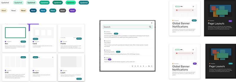
Design Recommendation 1: Tags
Put tags on the components’ card, the search menu, and within the section that has been updated. This way, people can see the update no matter how they access the guidance, whether it’s browsing through the site, searching for the component or opening up a component’s guidance page directly.


Design Recommendation 2: Indications on top of the page
When the user first looks at the web page, they will see a notification stating the update and dots on the side navigation to signify that there’s an update to that section. This design recommendation prompts the user to jump to that section to check out the update.

Design Recommendation 3: Change Log
A change log at the bottom of each component’s change can showcase all past versions of the component. This can give the user a comprehensive list of updates. Developers can also compare current versions to past versions.

Design Iterations
After receiving support from my teammates and other stakeholders, I went into the process of iterating on my design recommendations.
Communicating with developer
I also communicated with my project partner, the development intern to make sure the design recommendations can be implemented.
I needed to determine how long on the website the tags and notifications should show. If too many tags and notifications build up for too long, the overall website can be overcrowded. My project partner and I determined that there are two key components to decide whether the user should see the update.
1. The amount of time since the PR with the update was merged.
-
After considering how often updates are being made, we decided to only show updates within the last 30 days.
2. Last time the user visited the guidance page.
-
If the user has already seen the update, then the update will not show up again. We’ll use local storage to track visitation data.
Challenges
When implementing the change log, we realized that with the current development set up, the API can only call up to 100 pull requests per fetch per page. Every time the team needs to make an update, they need to submit a pull request. To populate a change log, we need to fetch all the past pull requests. However, with the thousands of pull requests we have, fetching it and populating the change log would take very long and ruin the user experience.
Solution
From the user research insights, I saw that it still was important to show the users a list of updates, so I decided to have a full change log on a separate page. The full change log would be populated with the first few updates, then users can click the load more to see more updates. There would still be a change log on each components page that only shows the updates within the past 3 months. If there are no updates, the user would be redirected to the full change log.

User Testing
I conducted user testing with 4 teammates by asking them to share their screen, go through their normal workflow and ask if they can identify and understand updates along the way. Overall, they expressed that
-
full change log was very helpful because they can quickly see global changes
-
the update notification system gave them confidence that the site is active, not stale
-
easy to find and understand the update
In addition, they also expressed that they wish they can filter/search through the full change log more easily, and have a section level indicator as well.
Due to the time constraint of this internship, I started initial sketches to incorporate those feedback, but was unable to have final deliverables for the new features.
Success Criteria Check
Accessibility
-
We had a meeting with Bill Tipton, HPE’s accessibility champion, for him to use his screen reader to go through our design implementations. He checked that our designs and implementation are accessible.
Functionality
-
users reported that the features were able to help them find relevant updates quickie.
Ease of use
-
Users found the features intuitive and fit well into their current workflow.
Feasibility
-
We were able to implement features in our original scope, and the features are low maintenance for the team.
Final Product

Reflection
Next steps
If I had more time, I would work on adding search and filter onto the full change log, and decide on where the full change log page should rest within the design systems website. I would also spend more time on exploring colors for light and dark mode.
Lessons Learned
One of the biggest lesson I learned is to always design with accessibility in mind. I learned about the WCAG standards and conducting user testing with screen readers and other assistive technology.
I also had to practice my skill of designing using design system components. There are certain constraints I have to follow for each component. It is important to read the guidance and understand the do's and don't's when using design system components. It was also my first time writing guidances for my designs!
Success criteria was also a concept foreign to me before this internship. Success criteria helped this project stay on track with the time frame. I will definitely use this concept in my future design projects.
My time at HPE
I had a wonderful time working with the design systems team at HPE. I had an amazing mentor, Kenny Tran, and manager, Scott Oja, who helped me every step of the way. Everybody on the team was eager to help and answer my many questions. I'm also very grateful to work with the developement intern as my project partner. Without her, my designs would not have come alive. I felt lots of validation as a designer, and became more confident in my skill sets. This is the first time solo-ing a design project all by myself. My time at HPE helped me grow as a person and as a designer.
